By Milaniya Nguyen, Year 12
A drummer, blinded by his desperate aspiration to become one of the greats, is slowly pushed to the edge of sanity by his suffocating ambition and his psychotic, abusive mentor. Whiplash, a movie released in 2014, tells the story of an upcoming jazz drummer, Andrew Neiman, and his convoluted experience at a music conservatory in New York. Terence Fletcher, a music teacher and mentor, believes that true talent can only arise by pushing his students to their absolute limits with violently manipulative methods.
Now what color would you first associate with this dark, twisted story of an aspiring musician ruined by the extremity of his teacher? My first guess wouldn’t be a bright, welcoming yellow. Yet this is exactly what the director, Damien Chazelle, uses as a key color in the color grading of Whiplash. This misleading, subversion of expectations is what makes the movie and its story line so much more jarring to viewers.
Color grading is an essential element of movie making, and every movie is color graded or color corrected in some way, whether it be realistic or unique to that specific film. The color palette and general tones of a movie are completely dependent on the story and the emotions the director wants to communicate to its audience. This is where color theory comes in. Every color has particular associations connected to them, and filmmakers use these associations to portray distinct emotions during certain scenes or across the whole length of a movie. Additionally, changes in color can indicate shifts in the story line or of a character’s emotional state. All in all, colors are a crucial aspect of storytelling in a movie.
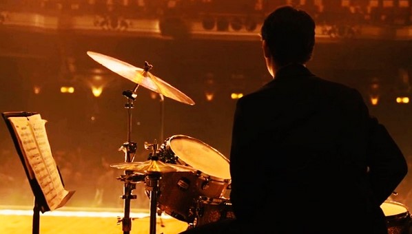
So why is Whiplash such a predominantly jarring yellow? Initially, this use of warm toned yellows is said to be used to make the brass instruments pop, but there is clearly more meaning behind this specific use of color grading. These yellow tones most stand out when Neiman first enters Fletcher’s practice room. Fletcher initially gives Neiman a warm welcome and encourages him as he begins to play the drums. Then in one abrupt moment, all goes wrong. Neiman goes ever so slightly off tempo, and Fletcher responds by hurling a chair at his head and brutally berating and threatening him. This instantaneous change in behavior from Fletcher is shocking and unanticipated, making it so much more jarring of a scene. Moreover, what adds onto this alarming scene is the use of color.
This entire scene uses warm tones, the room filled with welcoming, inviting yellows and oranges. This creates an illusion, the subtle deception that this room is a welcome environment for Neiman. This not only misleads Neiman but us, the viewers. These warm colors that completely dominate the scene, subvert audience expectations. It tricks our subconscious and what we previously associate with these bright colors and uses it against us. We don’t expect this sudden change in atmosphere and mood, which makes it so much more stirring of a scene. This scene’s use of color reveals Fletcher’s true nature as a teacher and mentor in the most effective way possible.
These warm tones are also generally used to amplify intense emotions felt throughout the movie, as well as to indicate rising tensions between Neiman and Fletcher. As tensions rise, colors become more striking and intense, reflecting the increasingly aggravated emotional states of Whiplash’s leading characters. The deliberate use of color palettes and tones is a key part of what gives Whiplash such a memorable and distinct visual feel and what makes this movie one of Chazelle’s best. This masterful color grading, amplifies the emotional, stirring story of a jazz drummer’s tumultuous journey to fame.